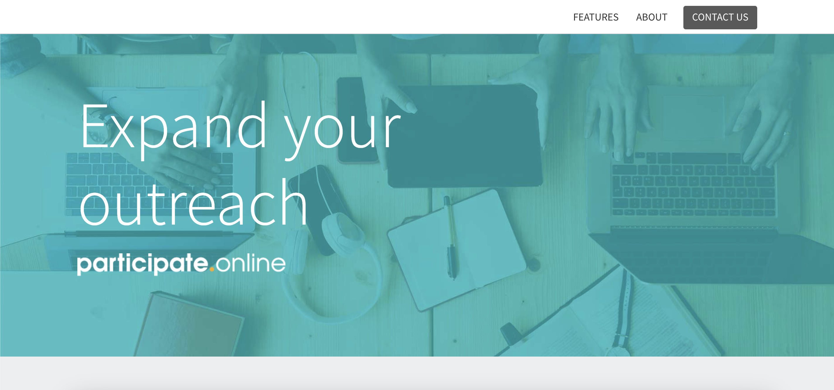
A website promoting EnviroIssues’ participate.online community engagement service.
Role
UI Designer | Web Developer
Duration
7 months
Context
During my time at EnviroIssues, I worked as a Web Developer on the Development team to build community engagement project websites and with the Digital Accessibility team to improve web accessibility. Part of this work included redesigning our participate.online services website to feature a more modern and accessible format.
Design Goal
To improve the user experience of the participate.online services website, enhance branding impact, add new content sections, and incorporate the core features in an interactive way.
Target Users
- Current and prospective clients
- Federal, state, and local agencies
- Creative studio teams
- Project staff
Design Criteria
Ease of use – All important information needs to be easy to access and have a smooth contact flow.
Responsive and accessible – One of the core features of participate.online’s project websites and digital tools. The design style integrates adaptable elements and layout structures with a strong emphasis on usability.
Problem Space
With a recent shift to developing participate.online websites in WordPress, the Development team was looking to redesign the main service website to align with the new CMS theme. The participate.online UI design was dated, visually domineering, and lacked user interactivity. Additionally, my work with the Digital Accessibility team brought up several accessibility concerns that we wanted to improve on in the new design.
Original

Redesign

Research
Competitive Analysis
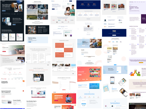
To better understand the current landscape of solutions, I looked into existing websites targeted towards similar clients. This included seeing how they were visually displayed, their interactions, and the various design systems. I took note of commonalities and differences to gather evidence to support my design decisions.
Style Guide
Based on my research and design requirements, I created a style guide with details on color palettes, iconography, and typography.
Color
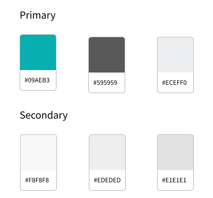
The color palette utilizes monochromatic colors along with a bold primary accent color to create more contrast between the different sections and content. Two of the primary colors were extracted from the EnviroIssues primary color palette to establish consistency across the brand. I ran my color choices through multiple color contrast accessibility evaluation tools before and after implementing my design.
Iconography

Typography
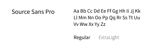
Source Sans Pro is the primary font used due to its minimalistic and modern look. The slightly condensed letterforms of Source Sans Pro make it ideal for user interfaces with limited screen space. Relative font sizes were defined with CSS allowing the text to be resized appropriately across multiple devices and platforms.
Ideation
Wireframing

Final Screen

Prototype

Example of participate.online website
Click on image to expand in a new tab.


