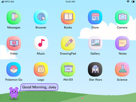
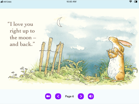
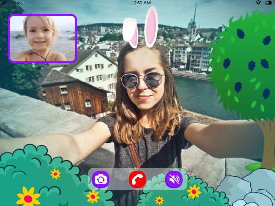
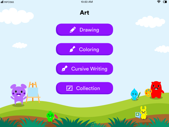
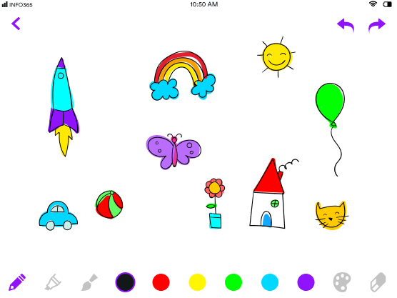
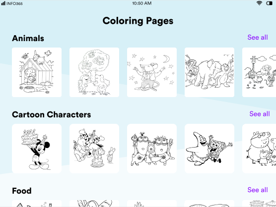
An OS designed to combine education and entertainment for children ages 4-10.
Role
UX Designer
Duration
December 2019 – March 2019
Context
As part of the Mobile App Design course from the UW Information School, our team was tasked with a project focused on User Interface Design. The primary course objective was to create a completely original mobile operating system and all of its core applications.
Problem Space
With media expanding to newer formats, including cellphones and tablets, increased portability and access has increased the use of technology for children. Currently, 42% of children ages 0-8 have their own tablet devices, a steep increase from 7% in 2013. Children now rely on technology for the majority of their play and entertainment. While technology can be a great tool that helps children learn, overusing technology can have negative effects on their development. The amount of time children are spending on devices not only concerns parents but also scientists and governments across the world. Ultimately, the decisions tech companies make about their products and the way parents monitor their kids’ behavior can have lasting effects.
Research
Since this project was part of a course, we had a limited time frame to conduct research. Given that our user group was children ages 4 -10, we wanted to understand their skill level in relation to technology as well as conduct a surface level competitive analysis.
Interactions: Signifiers
These are used to indicate which elements can be interacted with and provide feedback when an element has been engaged with. Signifiers help to make elements more discoverable and make sure the feedback is understood by the user. These include different button states as shown below where the button style changes based on the various states.
Gestures
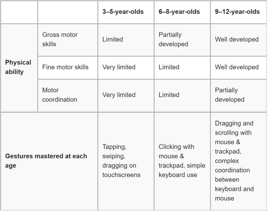
We looked at various gestures as a way to enhance interactions between our user group and the OS. Through our research we found that gestures, such as tapping, swiping, and dragging, are mastered by children between the ages of 3 to 5.
Motion: Transitions
Smooth transitions allow users to understand how they’re moving from one element to another. When used properly and carefully executed, Motion Design can augment the delivery of a message.
Visual Inspiration
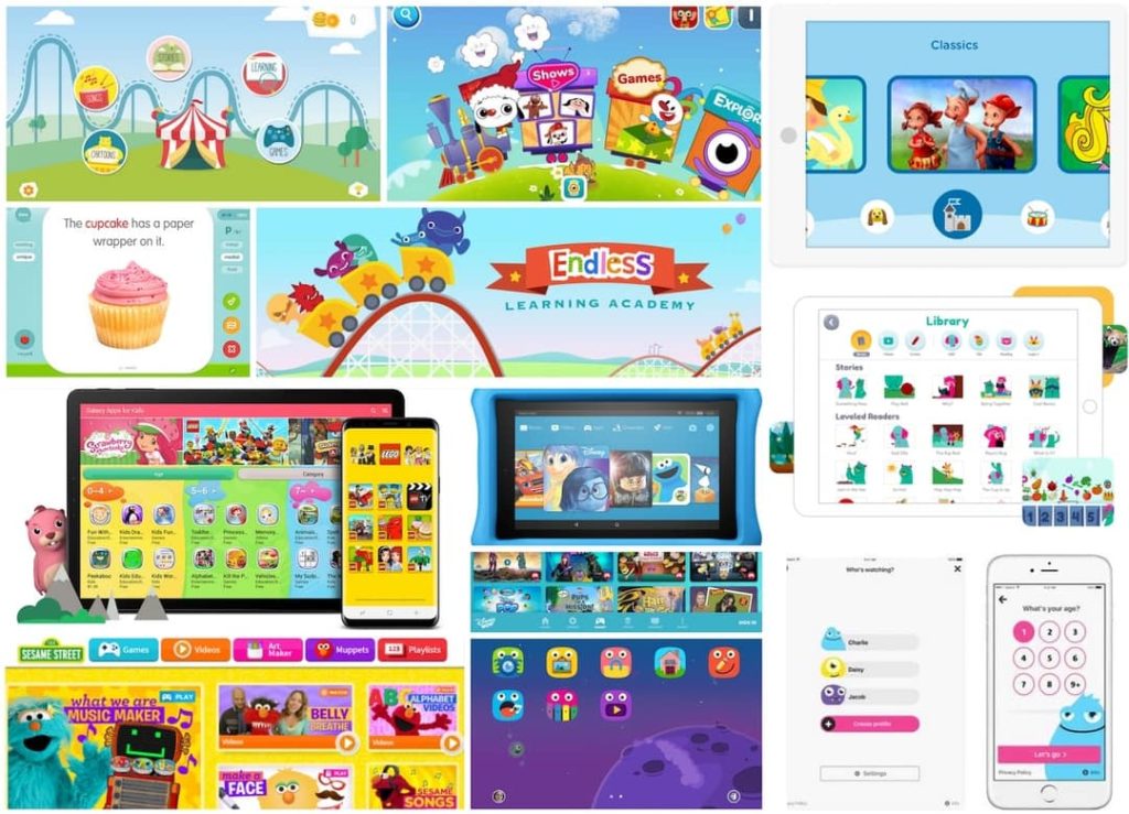
We created a vision board to better understand the direction we wanted to go in. We used this vision board as a visual reference to extract design guidelines and inform our style guide.
Design Principles
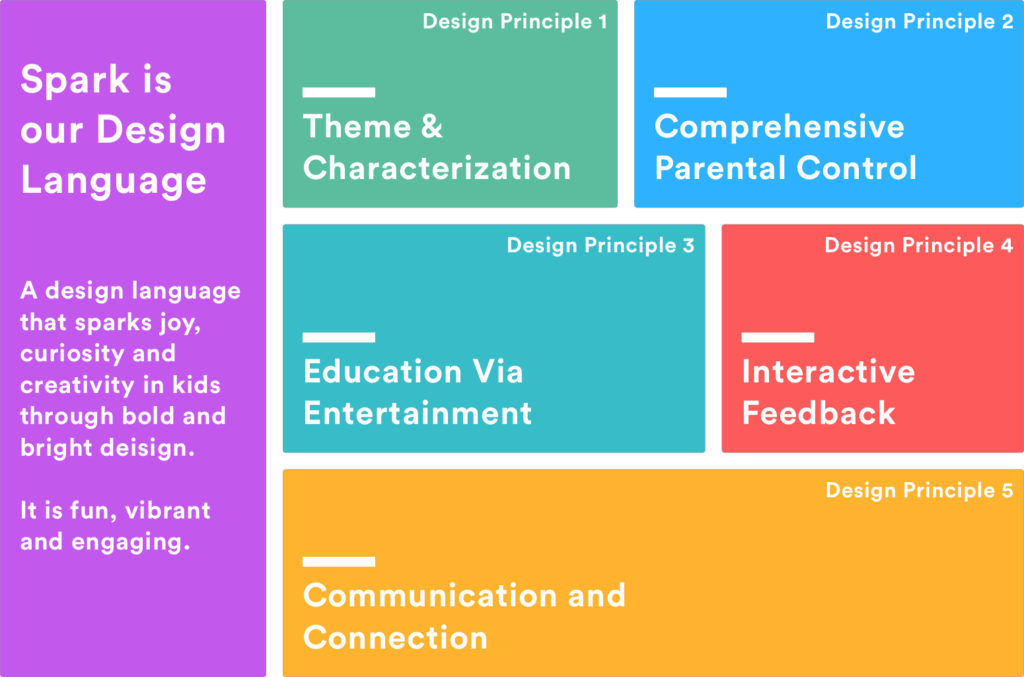
We expanded our research further to develop design principles that we based our operating system on. These values would be reflected in all the applications we built and helped to lay a strong foundation for the voice of the OS.
Communication and Connection
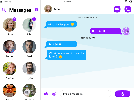
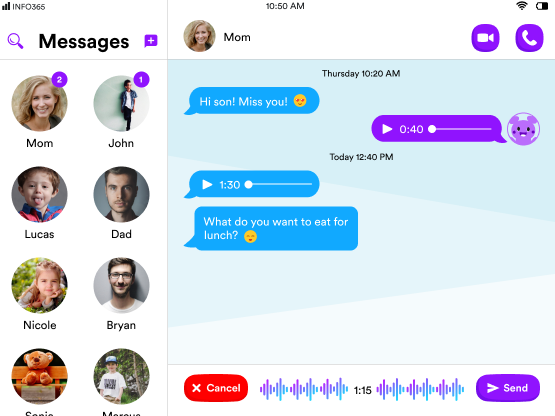
Mobile devices provide children with an independence in their communications with friends and family. With this independence, the focus here was to create a simple and effective way to communicate with others and stay connected.
Comprehensive Parental Controls
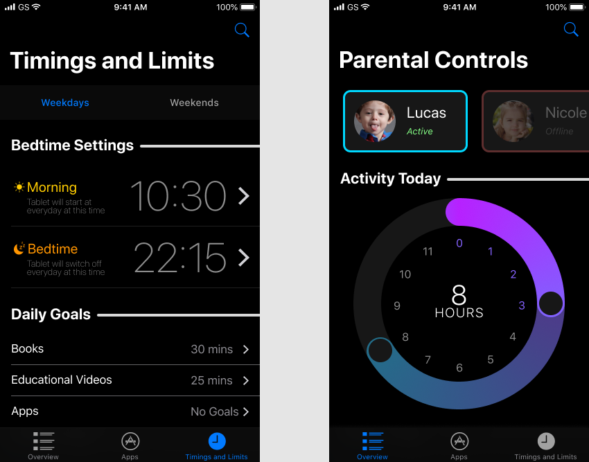
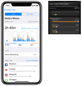
As children between the ages of 4 to 10 are in a critical period for development, it is important for parents to have access to their child’s usage of the OS. The ability to monitor the content their children see and control screen time allows for a safer utilization of our operating system.
Education via Entertainment
The main purpose of our OS is to develop the educational needs of children by creating an entertaining and engaging environment. Perhaps the most important design principal, combining education and entertainment in an effective way can help children enjoy rich delights and profound learning simultaneously.
Interactive Feedback
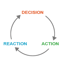
The feedback loop is an essential aspect to consider especially when designing for children. Based on our research we found that children want feedback when they do something because they tend to act first then see the consequences themselves. Hence, the Action -> Reaction -> Decision model is beneficial to keep in mind when designing for children.
Style Guide
Based on our research and design requirements, we developed a style guide that reflected the design principles and establish consistency in creating the OS. With 5 designers working on this project, we felt it was essential to understand the style guide to ensure uniformity across our designs.
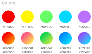
Color
We utilized bright primary and secondary colors in our color palette as a way to help aid children’s visual development. Children prefer these brighter colors because there are easier to perceive making them more stimulating and interesting.
Iconography

Typography
We decided to use Circular as the main font due to its distinct geometric look as a sans-serif font. Circular helps to decrease the harshness when reading text and lessen the strain on our users eyes. The simplistic nature of the font worked well for both headings and body text.
Readability Practices
Letter spacing: Letter spacing should increase with smaller font sizes and decrease with larger font sizes.
Line Height: Line height should be between 140% – 180%
Line Length: Line length of body text should be between 60 and 75 characters per line and should not exceed 100 characters per line.
Ideation
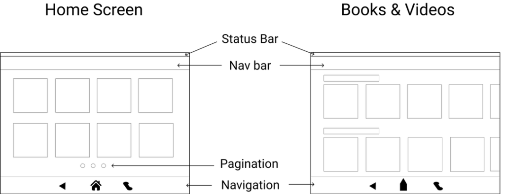
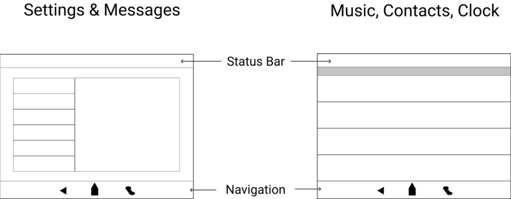
Wireframing
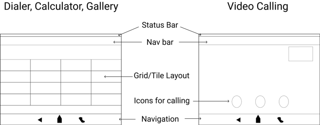
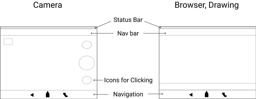
We created a set of interface layouts and templates to help us better conceptualize our designs. As a team of designers, we thought it would be beneficial to collaborate and collectively come up with the wireframes to represent our style guide in a consistent way. Although these aren’t the layouts we used in the final version, below are the detailed annotated wireframes. After our design critiques we decide to go with a separate UI that is detailed later on.
Visual Design
To create our final designs, we first had to develop a visual system. After creating our first version, we presented our designs to our peers and iterated based on their critique.
Design Language
We created Spark as our design language before beginning our visual design process. This was meant to help guide and represent our research and design requirements. The design language proved essential for guiding our work in a unified direction and bringing uniformity to our designs.
Iteration
First Iteration
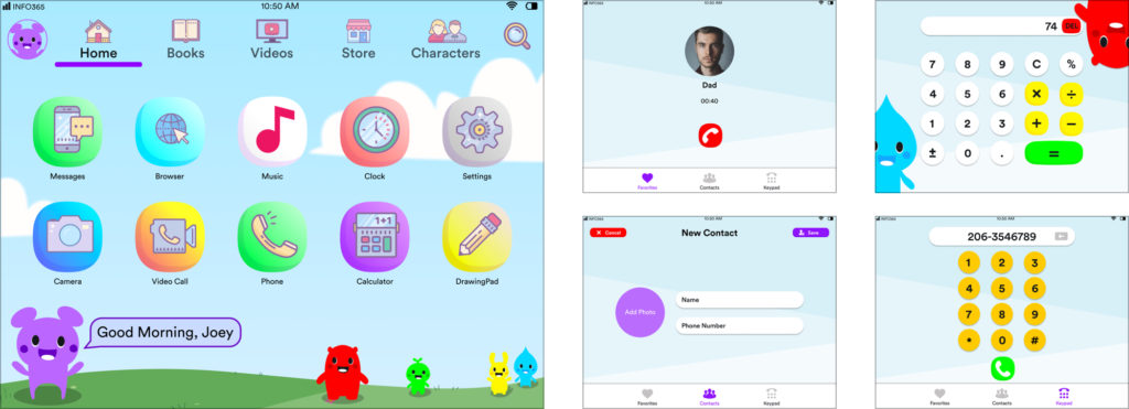
We started developing various applications that would be part of the native Spring OS system. Every 2 weeks we ideated, conceptualized, and designed the main screens of 5 new applications. During this time our project took an interesting pivot in terms of our visual design.
Initially our design was heavily rooted in Android and the Amazon Kindle Fire (Kids Edition). It felt overcrowded along with instances of under-utilizing screen real estate. This caused an inconsistency in the overall feel of the product and we had to rethink our design strategy.
Gestures
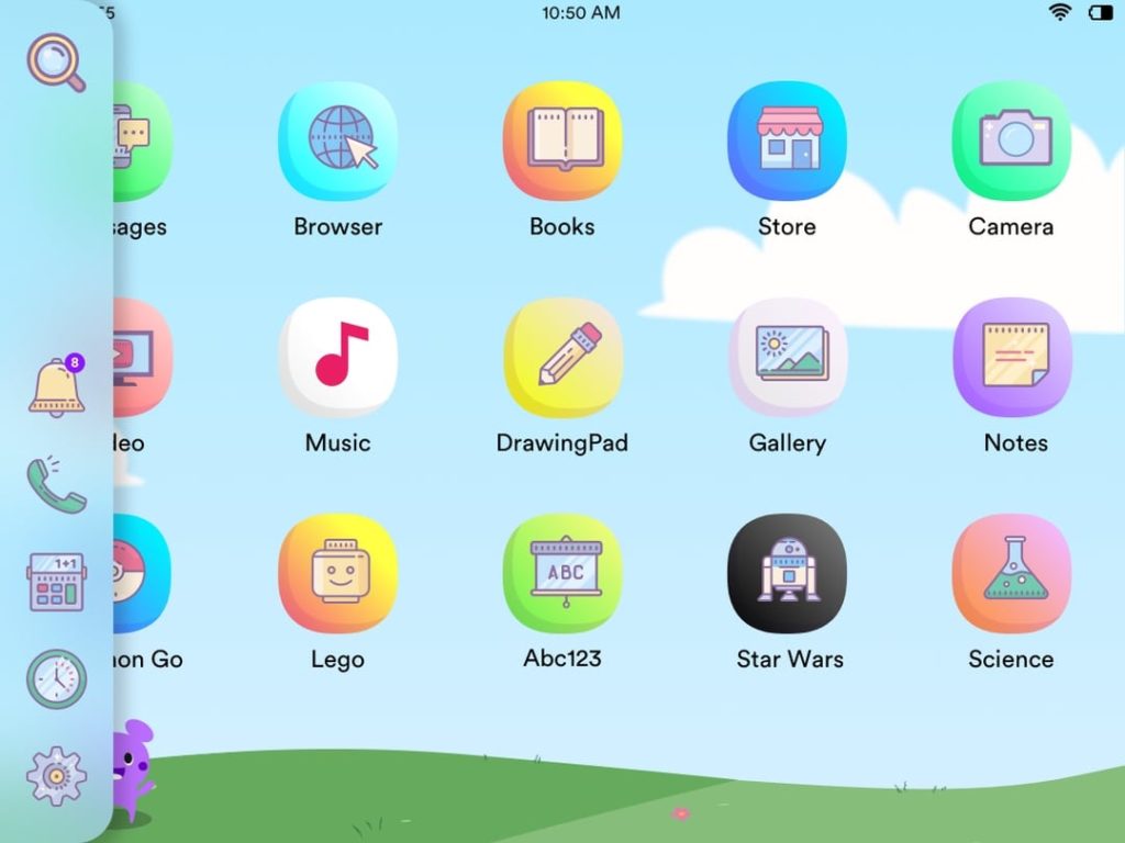
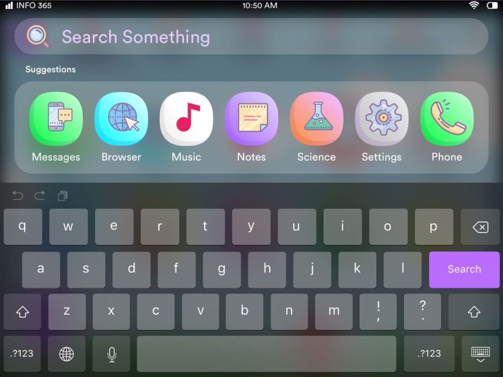
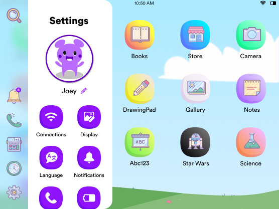
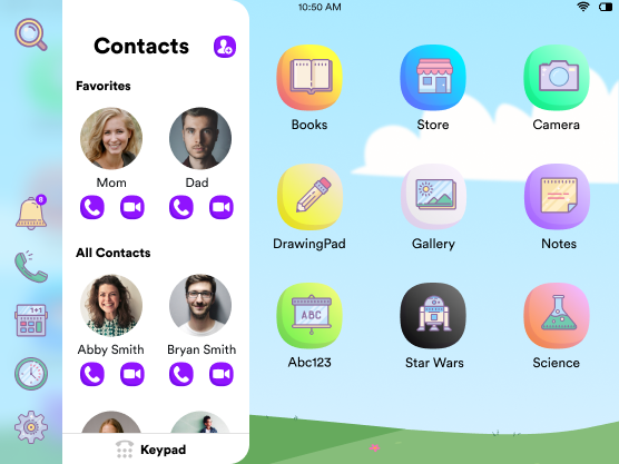
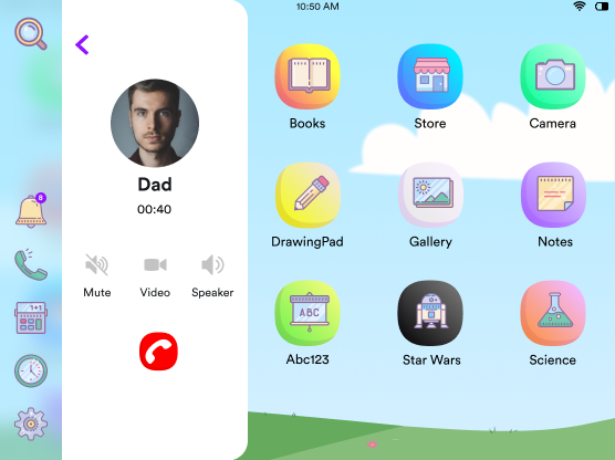
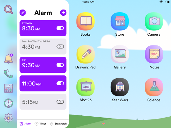
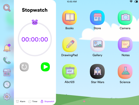
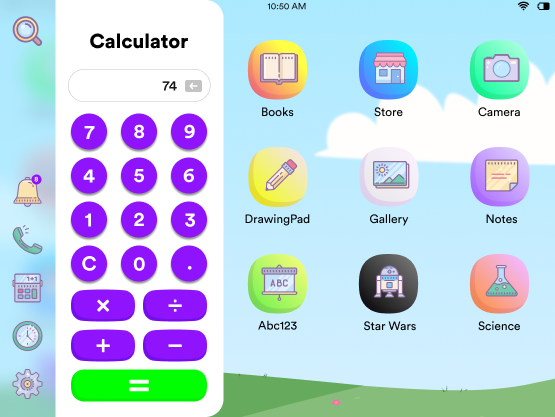
Based on the feedback from our first iteration, we developed a series of additional gestures that included a floating vertical nav bar. This nav bar could launch ‘smaller’ applications or utilities in separate windows as a way to use screen space more effectively.
Modifications
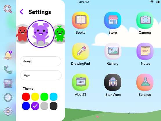
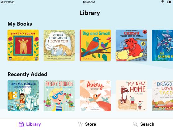
With our newly designed navigation system, we began separating applications by their screen size. Each of our applications were categorized as either a small screen or full screen application. We created a high fidelity navigation bar and redesigned the home screen to better align with the nav bar.
Final Screens
Reflection
Working on this project was exciting because I got to collaborate and work with a team of 5 designers. I learned how to better communicate with different people within the same field of work. Another important skill I learned was how to better prepare and participate in design critiques. I was able to continually improve my designs with feedback from my professors and am now more confident in presenting my designs within a given time limit.

